NOTE: This forum is no longer active. This is an archive copy of the forum as it was on 10 March 2018.

Society Logo

Everything Irish Whiskey Society related.

Re: Society Logo

Postby IrishWhiskeyChaser » Tue Apr 21, 2009 2:38 pm

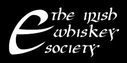
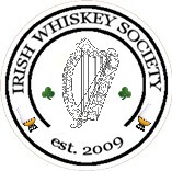
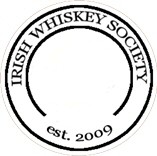
DavidH wrote:Shouldn't "Dublin" say "Goblin" instead?


Too lazy to put too much effort into it ;)
Sláinte Adrian
IrishWhiskeyChaser
Site Admin
 
Posts: 2910
Joined: Tue Mar 17, 2009 1:37 pm
Location: A Dark Dunnage somewhere in Galway
Top

Re: Society Logo

Postby jcskinner » Tue Apr 21, 2009 5:31 pm

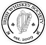
varizoltan wrote:as most people liked my disign at the meeting, becouse it was simple and clearly understandable and i think i am not far away from the definition above and as i said that night colour can be adjusted or date or Dublin can be taken off

so i do not agree to have anything written in irish, or the claddagh design on the logo
the less we put on it the better the logo is (look at; nike,mercedes etc. all simple)
we can have mottos on the webpage in irish, what i think be better
(and if we could change the color on the top of the page from black to green, to have a kind of happy irish look, becouse i think the black need to present a funeral, and not an irish whiskey society)

...

i do not think i am the only one who think this...


While I was one of those who congratulated you at the meeting on the undoubted effort you put in, Zoltan, I think I do have to respond to some of your post above.
Firstly, there is a clear need to have a logo which functions in black and white as well as in colour. That to me would seem self-evident.
Secondly, I really must argue again that since this is an Irish whiskey society, it is important to my mind to establish the separateness of the identity from Scotch and Scotland, and it seems to me that the Irish language is an ideal and simple way to do this.
According to the constitution of the state, Irish has equal if not superior legal status to English. I don't think it is overly off-putting to new members or would-be members, even those from abroad, if the society gave both languages equal precedence in terms of titling and the logo. There are numerous bodies in Ireland which provide both versions of their name in their logos and none of them seem cluttered as a result.
I still appreciate the work you did in bringing an image for people to peruse, but I agree with other posters that we need to see more options and choose from a wider range of ideas. I am also a little concerned that the image you presented appears to be too close to the logo of an existing whisky society for copyright comfort.
jcskinner
Bourbon Barrel
 
Posts: 462
Joined: Sun Mar 29, 2009 2:19 pm
Top

Re: Society Logo

Postby varizoltan » Wed Apr 22, 2009 8:50 pm

:shock:
Last edited by varizoltan on Sun Apr 26, 2009 3:53 pm, edited 2 times in total.
Happiness is having a rare steak,a bottle of whiskey, and a dog to eat the rare steak!!!
User avatar
varizoltan
Fully mature Cask
 
Posts: 1023
Joined: Fri Mar 20, 2009 11:03 pm
Location: Hungary
Top

Re: Society Logo

Postby jcskinner » Thu Apr 23, 2009 1:32 am

Nice!
jcskinner
Bourbon Barrel
 
Posts: 462
Joined: Sun Mar 29, 2009 2:19 pm
Top

Re: Society Logo

Postby IrishWhiskeyChaser » Thu Apr 23, 2009 11:02 am

The Kerry colours too that'll do :lol:

A few typo's I presume Zoltan

should be

Cumann Uisce beatha na hÉireann
Sláinte Adrian
IrishWhiskeyChaser
Site Admin
 
Posts: 2910
Joined: Tue Mar 17, 2009 1:37 pm
Location: A Dark Dunnage somewhere in Galway
Top

Re: Society Logo

Postby DavidH » Thu Apr 23, 2009 11:43 am

IrishWhiskeyChaser wrote:The Kerry colours too that'll do :lol:

Yup, it should be blue, Zoltan, for Dublin ("Áth Cliath").

;)
Website: Liquid Irish
Twitter: @LiquidIrish
User avatar
DavidH
Fully mature Cask
 
Posts: 1280
Joined: Tue Mar 17, 2009 7:49 pm
Location: Dublin
Top

Re: Society Logo

Postby IrishWhiskeyChaser » Thu Apr 30, 2009 12:20 pm

Here is the logo from the Irish Whiskey Trail which is another similar design to what we have.

Image
IrishWhiskeyChaser
Site Admin
 
Posts: 2910
Joined: Tue Mar 17, 2009 1:37 pm
Location: A Dark Dunnage somewhere in Galway
Top

Re: Society Logo

Postby DavidH » Thu Apr 30, 2009 12:42 pm

Instead of a circle (end-on cask view), how about a side-on cask view? This sort of shape:

barrell.png
barrell.png (1.85 KiB) Viewed 2267 times
Website: Liquid Irish
Twitter: @LiquidIrish
User avatar
DavidH
Fully mature Cask
 
Posts: 1280
Joined: Tue Mar 17, 2009 7:49 pm
Location: Dublin
Top

Re: Society Logo

Postby DavidH » Tue May 05, 2009 12:34 am

A new concept:

iws.png
iws.png (4.32 KiB) Viewed 2254 times


It makes a feature of the letter 'e'. It's also in the Uncial style, as you would find in many an old Irish manuscript, yet the overall effect is modern, I think.

I'm sure a professional designer could do more with this idea, if we sent it out.
Website: Liquid Irish
Twitter: @LiquidIrish
User avatar
DavidH
Fully mature Cask
 
Posts: 1280
Joined: Tue Mar 17, 2009 7:49 pm
Location: Dublin
Top

Re: Society Logo

Postby PureDrop » Tue May 05, 2009 10:49 pm

That's a nice alternative approach David.
Is the "E" the missing "e" in whisk(e)y?
It would work well black-on-white or reversed. Whatever the font is, the letter "Y" is very unusual in terms of the stroke emphasis - like something from Tolkien.
Michael
User avatar
PureDrop
Rundlet Cask
 
Posts: 185
Joined: Tue Apr 07, 2009 2:36 pm
Top

Re: Society Logo

Postby DavidH » Tue May 05, 2009 10:57 pm

Right, the 'e' is a distinguishing, universal feature of Irish whiskey today. It becomes almost abstract at that scale though.

The 'y' does look unusual but it came with the free Uncial font I downloaded last night. The dot would be easy to delete. If people think it's worth pursuing this line, I can look for alternative fonts. A good designer would have a font library anyway.
Website: Liquid Irish
Twitter: @LiquidIrish
User avatar
DavidH
Fully mature Cask
 
Posts: 1280
Joined: Tue Mar 17, 2009 7:49 pm
Location: Dublin
Top

Re: Society Logo

Postby IrishWhiskeyChaser » Thu May 07, 2009 9:41 am

What about 3 copita / glencairn glasses fanned out at the stem to make a shamrock as a symbol.

Not sure it would work but another idea that might spark off something.
Sláinte Adrian
IrishWhiskeyChaser
Site Admin
 
Posts: 2910
Joined: Tue Mar 17, 2009 1:37 pm
Location: A Dark Dunnage somewhere in Galway
Top

Re: Society Logo

Postby jcskinner » Thu May 07, 2009 1:43 pm

I was playing with an idea of a shamrock with a bottle, potstill or cask on each of the three leaves.
But since I'm about not at all graphically talented, I'll spare you the Microsoft Draw horror of my attempts. The description probably suffices.
I like the idea of making a feature of the letter E somehow, though.
jcskinner
Bourbon Barrel
 
Posts: 462
Joined: Sun Mar 29, 2009 2:19 pm
Top

Re: Society Logo

Postby PureDrop » Thu May 07, 2009 2:02 pm

Inspired by Shamrocks and Glencairn glasses ... :lol:
lep2.jpg
lep2.jpg (37.6 KiB) Viewed 2226 times

And who couldn't like the Dunville's shamrock Lady at
http://www.irishinspiration.com/acatalog/Collectable_Irish_Whiskey_Signs_Plaques.html
- not so gone on the Shamrock Whiskey one though.

Or one could have a stylised shamrock core to the zoltan stamp
s2.jpg
s2.jpg (9.52 KiB) Viewed 2225 times
or
s1.jpg
s1.jpg (9.39 KiB) Viewed 2225 times

(again, concepts only)
Michael
Last edited by PureDrop on Thu May 07, 2009 2:42 pm, edited 2 times in total.
User avatar
PureDrop
Rundlet Cask
 
Posts: 185
Joined: Tue Apr 07, 2009 2:36 pm
Top

Re: Society Logo

Postby DavidH » Thu May 07, 2009 2:06 pm

Begorrah, if that's not our new logo then my name's not Paddy James O'Flaherty, so it isn't.

:D
Website: Liquid Irish
Twitter: @LiquidIrish
User avatar
DavidH
Fully mature Cask
 
Posts: 1280
Joined: Tue Mar 17, 2009 7:49 pm
Location: Dublin
Top

Re: Society Logo

Postby varizoltan » Fri May 08, 2009 1:16 am

this is the one i like the most!!!!!!!!

MichaelS wrote:Inspired by Shamrocks and Glencairn glasses ... :lol:
lep2.jpg

And who couldn't like the Dunville's shamrock Lady at
http://www.irishinspiration.com/acatalog/Collectable_Irish_Whiskey_Signs_Plaques.html
- not so gone on the Shamrock Whiskey one though.

Or one could have a stylised shamrock core to the zoltan stamp
s2.jpg
or
s1.jpg

(again, concepts only)
Michael
Happiness is having a rare steak,a bottle of whiskey, and a dog to eat the rare steak!!!
User avatar
varizoltan
Fully mature Cask
 
Posts: 1023
Joined: Fri Mar 20, 2009 11:03 pm
Location: Hungary
Top

Re: Society Logo

Postby IrishWhiskeyChaser » Fri May 08, 2009 10:05 am

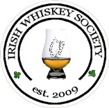
DavidH wrote:Begorrah, if that's not our new logo then my name's not Paddy James O'Flaherty, so it isn't.

:D


I was thinking that also before I posted but I all fairness to the shamrock is instantaneously associated all things Irish and whether people associate it with plastic paddy or not it also has an immediate & powerful effect on the viewers mind and really dose not let it to ambiguity as to what nationality you are. I suppose the harp would be just as good.

Just worth thinking about and not necessarily used as the main symbol.
Sláinte Adrian
IrishWhiskeyChaser
Site Admin
 
Posts: 2910
Joined: Tue Mar 17, 2009 1:37 pm
Location: A Dark Dunnage somewhere in Galway
Top

Re: Society Logo

Postby IrishWhiskeyChaser » Fri May 08, 2009 11:25 am

Just having a bit of fun here and again trying to arouse the creative juices of other members.


IWScoinlogo.jpg
Coin Logo
IWScoinlogo.jpg (12.53 KiB) Viewed 2216 times
IWScoinlogoB&W.jpg
Coin Logo Black & White
IWScoinlogoB&W.jpg (12.29 KiB) Viewed 2215 times


IWSharpshamlogo.jpg
Glass Logo
IWSharpshamlogo.jpg (11.13 KiB) Viewed 2219 times
IWSharpglasslogo.jpg
Glass Logo Black & White
IWSharpglasslogo.jpg (11.17 KiB) Viewed 2219 times


IWSBlanklogo.jpg
Blank logo
IWSBlanklogo.jpg (9.25 KiB) Viewed 2219 times


A blank logo for anybody else to play with
Sláinte Adrian
IrishWhiskeyChaser
Site Admin
 
Posts: 2910
Joined: Tue Mar 17, 2009 1:37 pm
Location: A Dark Dunnage somewhere in Galway
Top

Re: Society Logo

Postby DavidH » Fri May 08, 2009 11:49 am

I'm quite taken by Michael's disguised trefoil, the one with the casks stacked horizontally.

I think we are too caught up with sticking things insides circles though. The horizontal casks suggest a more horizontally-oriented logo to me. But this is where a real designer could add value. "Here are the design elements and text; please combine them in a fresh, modern way."

I wouldn't mind seeing a harp or shamrock incorporated into a complex logo, woven from several elements. But on their own they look too generic. Something like a coat of arms, like this one from the Goldsmiths' Guild:

Image

These are rich with symbolism and often incorporate shamrocks and harps to indicate an Irish association.
Website: Liquid Irish
Twitter: @LiquidIrish
User avatar
DavidH
Fully mature Cask
 
Posts: 1280
Joined: Tue Mar 17, 2009 7:49 pm
Location: Dublin
Top

Re: Society Logo

Postby IrishWhiskeyChaser » Fri May 08, 2009 12:03 pm
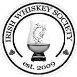
DavidH wrote:...
I think we are too caught up with sticking things insides circles though.


I totally agree unfortunately any time there has been discussion the Circular design seems to be centre of attention so to me that means most people approve of it so lets get thinking out side the circle (I mean box ;) ).


DavidH wrote:...


... rich with symbolism and often incorporate shamrocks and harps to indicate an Irish association.


No problem with that just keep in mind we need something that can be swapped across to get polos shirts embroidered and glasses etched. Nothing too intricate but it does not need to be plain and basic either.

Embroidery and etching is all done by computers these days and it can handle more than people realise. I want an Irish Whiskey Society logo'd polo anyway :lol:
Sláinte Adrian
IrishWhiskeyChaser
Site Admin
 
Posts: 2910
Joined: Tue Mar 17, 2009 1:37 pm
Location: A Dark Dunnage somewhere in Galway
Top

Re: Society Logo

Postby PureDrop » Fri May 08, 2009 1:04 pm

I want an Irish Whiskey Society logo'd polo anyway

So we're sticking with a circle then - you're first knick-knack would be a pack of Irish Whiskey Society-etched Polos :D
polo.jpg
polo.jpg (19.08 KiB) Viewed 2214 times
User avatar
PureDrop
Rundlet Cask
 
Posts: 185
Joined: Tue Apr 07, 2009 2:36 pm
Top

Re: Society Logo

Postby DavidH » Fri May 08, 2009 1:19 pm

I should add I don't want a coat of arms. I was trying to think of an example where various symbols were incorporated into a single logo. I have a poor photocopy of the old Dublin Coopers Guild coat of arms which incorporates shamrock, barrels, coopering, horses rampant and so on. The quality is too poor to show it so I randomly selected the goldsmiths' one. There is probably a way to come up with a modern equivalent.

It's a good point about etching and stitching. One advantage of having a stylised 'e' is that it's monochrome and can be transferred to any medium. It can also stand on its own, like the Nike swoosh, on a tie or cufflinks or whatever, that you don't want people to be "reading" (I'd include all clothing in that category :? ).
Website: Liquid Irish
Twitter: @LiquidIrish
User avatar
DavidH
Fully mature Cask
 
Posts: 1280
Joined: Tue Mar 17, 2009 7:49 pm
Location: Dublin
Top

Re: Society Logo

Postby DavidH » Fri May 08, 2009 3:09 pm

OK, new concept...

iws2.png
iws2.png (1.72 KiB) Viewed 2199 times


Rough sketch, as usual. This uses the ogham representation of 'e' - one horizontal and four intersecting verticals.

Again, it's simple, monochrome and modern yet it also incoporates references to Irish tradition (ogham) and Irish whiskey ('e').

Please ignore the crudity of the drawing. This could be dressed up in lots of ways. Ogham can also be written vertically.
Website: Liquid Irish
Twitter: @LiquidIrish
User avatar
DavidH
Fully mature Cask
 
Posts: 1280
Joined: Tue Mar 17, 2009 7:49 pm
Location: Dublin
Top

Re: Society Logo

Postby IrishWhiskeyChaser » Fri May 08, 2009 3:43 pm

It's a strange world ... I was thinking hard about your Idea David with the E and how we could improve on it as it in principle was an excellent idea. Now I just have been talking to Leo and he just remarked about having a look at the L.A. Whiskey society website as it was a good society site and if I want to stick their logo up on the forum to give people ideas. It pains me to say David they have already come up with the E idea

see

lLAws-banner.jpg
lLAws-banner.jpg (8.13 KiB) Viewed 2198 times


the site is here


We still could play with the idea though
Sláinte Adrian
IrishWhiskeyChaser
Site Admin
 
Posts: 2910
Joined: Tue Mar 17, 2009 1:37 pm
Location: A Dark Dunnage somewhere in Galway
Top

Re: Society Logo

Postby DavidH » Fri May 08, 2009 3:55 pm

Ooh, that was clever, making brackets out of the grain.

While they are covering their bases though, we would be asserting unambiguous ownership of the 'e' ;) The Uncial and ogham are sufficiently distinctive, I think, not to cause any trademark confusion.

But yeah, I'm a little bit crushed I wasn't the first to consider exploiting the 'e' for a whiskey society logo :(
Website: Liquid Irish
Twitter: @LiquidIrish
User avatar
DavidH
Fully mature Cask
 
Posts: 1280
Joined: Tue Mar 17, 2009 7:49 pm
Location: Dublin
Top

PreviousNext

Return to Society