I am having the final meeting with the graphic designer about
the logo next Monday 20th July before he commences the design
stage, this will be the last opportunity to receive input about
the design elements before he begins to produce a number of
'roughs' for us (I'm hoping he will produce 3, but I have to
finalise that next Monday).
As defined in the June
committee meeting, the purpose of the logo is to have a clear
identity for the society. It is planned to use the logo on
Publicity, Media Press Releases, Business Cards, Membership
Cards, Letterhead, The Website etc. and unusually it has to be
something that can be etched on a ‘Glencairn’ whiskey tasting
glass also.
The committee has agreed it should be a
modern logo for a modern society however we also wish to in some
way recognise, celebrate and convey the history/heritage of
Irish Whiskey within the logo somehow.
The ‘Logo’
thread will be the main source of guidance for the designer. At
this stage the shortlisted ideas are (1)the circular logo (like
a postage frank) which is popular with some members, the main
drawback with this design is commonly used by other groups (2)
the rectangular frank with rounded edges (being used as a stamp
on the forthcoming bottling with the text ‘Selected by the Irish
Whiskey Society’ as seen on the membership card (3) a variation
on the barrel logo (3a)a derivative of the line drawing of ‘e’
design within a barrel end shape (3b) a stencilled barrel
end.
In addition I will be bringing some materials
such as books, bottles, leaflets, glencairn glasses to provide
him with sources of additional inspiration.
I notice
from the thread that more recently a fourth idea is emerging (4)
the 'CUBE' lettering incorporated in a logo which could be
interesting as it is enigmatic and generates discussion about
what the letters stand for and who the society is, stimulating
curiousity and interest in the society.
The committee
has so far decided that essential requirements include the name
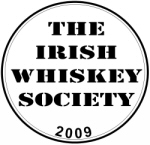
‘Irish Whiskey Society’, year of establishment/founded 2009, and
a symbol/brand.
The original target was by mid August
but I will have a clearer picture after next Monday's meeting,
but because the work is essentially being done gratis we are
subject to the designers work schedule.
The agreement
so far is the initial design is to be produced free of charge,
the designer himself is quite interested in the project, however
future work is likely to involve some fee.
In
addition he has been invited gratis to a tasting of his choice,
and subject to Society approval he may receive a bottle of the
Grand Crew for his efforts.
I would welcome it if
people wish to give some 'focussed' feedback ahead of next
Monday's meeting, as I will be giving guidance to the designer
and I need to be as clear as possible about what we hope to
achieve before we let him weave his magic on our logo. Hopefully
he will produce a design(s) that everyone feels represents the
society.
NOTE: This forum is no longer active. This is an archive copy of the forum as it was on 10 March 2018.
Society Logo
Society Logo Update
![]() by
TheWhiskeyBro
» Fri Jul 17, 2009 11:22 am
by
TheWhiskeyBro
» Fri Jul 17, 2009 11:22 am
- TheWhiskeyBro
- Hogshead
- Posts: 962
- Joined: Tue Mar 17, 2009 11:44 am
- Location: Sandyford, Dublin
Re: Society Logo
![]() by
DavidH
» Fri Jul 17, 2009 11:54 am
by
DavidH
» Fri Jul 17, 2009 11:54 am
Sounds like you have nailed it.
From the website point-of-view, I'd also like saturated colours. It's very difficult to pick up the unsaturated sort on the rest of the page. And, please, no swathes of orange! That would kill any hopes of an attractive site.
From the website point-of-view, I'd also like saturated colours. It's very difficult to pick up the unsaturated sort on the rest of the page. And, please, no swathes of orange! That would kill any hopes of an attractive site.
-

DavidH - Fully mature Cask
- Posts: 1280
- Joined: Tue Mar 17, 2009 7:49 pm
- Location: Dublin
Re: Society Logo
![]() by
John
» Fri Jul 17, 2009 12:22 pm
by
John
» Fri Jul 17, 2009 12:22 pm
I like that CUBE design. It is unique amongst the ideas
surfacing so far and I think that the overly-used barrell and
still motifs have been manipulated to bits over the years by
other groups. How to place the CUBE concept in a whiskey-related
setting for a logo design will be the real challenge.
Fair play for getting it all to this point, clealy a lot of work has gone into this from all quarters.
J.
Fair play for getting it all to this point, clealy a lot of work has gone into this from all quarters.
J.
Always carry a flagon of whiskey in case of snakebite and
furthermore; always carry a small snake - W.C. Fields et al.
-

John - Hogshead
- Posts: 641
- Joined: Tue Mar 24, 2009 1:32 pm
- Location: Dublin Mountains!

Re: Society Logo Update
![]() by
IrishWhiskeyChaser
» Fri Jul 17, 2009 12:49 pm
by
IrishWhiskeyChaser
» Fri Jul 17, 2009 12:49 pm
TheWhiskeyBros wrote:
The committee has agreed it should be a modern logo for a modern society however we also wish to in some way recognise, celebrate and convey the history/heritage of Irish Whiskey within the logo somehow.
I'm all for a cool design but just be cautious, modern is fine as long as it will also be classical. Nothing worse than having a modern design and it looking totally crap in 5 years time because it is no longer fashionable.
TheWhiskeyBros wrote:
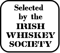
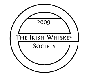
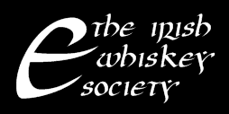
The ‘Logo’ thread will be the main source of guidance for the designer. At this stage the shortlisted ideas are (1)the circular logo (like a postage frank) which is popular with some members, the main drawback with this design is commonly used by other groups (2) the rectangular frank with rounded edges (being used as a stamp on the forthcoming bottling with the text ‘Selected by the Irish Whiskey Society’ as seen on the membership card (3) a variation on the barrel logo (3a)a derivative of the line drawing of ‘e’ design within a barrel end shape (3b) a stencilled barrel end.
1.
-
- Stamp
- IWSlogo7.jpg (39.59 KiB) Viewed 3206 times
-
- Square Stamp
- IWSlogo3.jpg (22.71 KiB) Viewed 3206 times
-
- BarrelE
- IWSlogo2.png (8.12 KiB) Viewed 3206 times
-
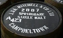
- SpringbankBarrel
- SpringbankBarrels.jpg (15.94 KiB) Viewed 3206 times
TheWhiskeyBros wrote:
I notice from the thread that more recently a fourth idea is emerging (4) the 'CUBE' lettering incorporated in a logo which could be interesting as it is enigmatic and generates discussion about what the letters stand for and who the society is, stimulating curiousity and interest in the society.
Well it looks like the committee are slacking up and not paying attention ... I think we'll have to get the committee marshalled to spend less time drinkin whiskey and eating pizza and get them to do more work
-
- IWSlogo1.png (4.32 KiB) Viewed 3206 times
-
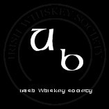
- UB
- IWSUBlogo.jpg (5.14 KiB) Viewed 3206 times
-
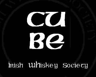
- CUBE
- IWSlogo4.jpg (18.4 KiB) Viewed 3206 times
TheWhiskeyBros wrote:
I would welcome it if people wish to give some 'focussed' feedback ahead of next Monday's meeting, as I will be giving guidance to the designer and I need to be as clear as possible about what we hope to achieve before we let him weave his magic on our logo. Hopefully he will produce a design(s) that everyone feels represents the society.
Personally I'd be happy in exploring ideas 1, 3 & 4 however I feel idea 2 is a bit light as a general log. This to me is only good as an associate stamp that we could use on products etc as a secondary stamp.
It is obvious that a designer need a focus but I feel that limiting it to 4 concentrated ideas may inhibit the designer. I feel that possibly we should have a 5th logo slot and that should be for the designers' own free interpretation with no remit from us if the designer so pleases to obligue of course. Remember this is their realm and they may have spare ideas that they are just waiting for the right opportunity to use on.
That is it from me I think
Great work and really looking forward to the end results.
Sláinte Adrian
- IrishWhiskeyChaser
- Site Admin
- Posts: 2910
- Joined: Tue Mar 17, 2009 1:37 pm
- Location: A Dark Dunnage somewhere in Galway
Re: Society Logo
![]() by
John
» Fri Jul 17, 2009 1:54 pm
by
John
» Fri Jul 17, 2009 1:54 pm
What can I say jc - on the ball as usual!!
Though I prefer it without the frozen water; oh no I've had a revelation, ok now I'm torn!
Down with the cube.
J.
Though I prefer it without the frozen water; oh no I've had a revelation, ok now I'm torn!
Down with the cube.
J.
Always carry a flagon of whiskey in case of snakebite and
furthermore; always carry a small snake - W.C. Fields et al.
-
John - Hogshead
- Posts: 641
- Joined: Tue Mar 24, 2009 1:32 pm
- Location: Dublin Mountains!
Society Logo - 5 Designs
![]() by
TheWhiskeyBro
» Fri Jul 17, 2009 3:09 pm
by
TheWhiskeyBro
» Fri Jul 17, 2009 3:09 pm
Bear in mind that it is one thing to produce a sketch or five,
but there would be an enormous amount of work for a graphic
designer to produce five 'roughs' on their design software.
Someone back me up here... hence in my post I am trying to keep
this focussed on two or three ideas for the designer to work on
including the giving the designer 'poetic licence' to introduce
his own interpretation. Cost is an issue for any embryonic
society, so unless we wish to invest money in the designers time
and creativity we have to have realistic about what we can
expect gratis.
Thoughts please!!!
Thoughts please!!!
- TheWhiskeyBro
- Hogshead
- Posts: 962
- Joined: Tue Mar 17, 2009 11:44 am
- Location: Sandyford, Dublin
Re: Society Logo
![]() by
IrishWhiskeyChaser
» Fri Jul 17, 2009 3:48 pm
by
IrishWhiskeyChaser
» Fri Jul 17, 2009 3:48 pm
It may not be that big of a deal as they are only explorations
rather than serious designs and then the wining design would be
properly worked on and various versions produced in various
formats which I thought was where a lot of time is spent.
However I agree we don't want to take the proverbials either so thanks for highlighting.
What about giving over the 5 or 6 suggestions (to include free interpretation) and let him chose 3 to produce for us.
Lastly I would not overly labour over the Glencairn & embroidery issue. I have been on to Glencairn and promotions firms and they are all confident they can reproduce most logo's and as long as it is not very intricate it can be reproduced. Obviously the simpler it is the better. All the styles we have currently are fairly basic.
Sláinte Adrian
- IrishWhiskeyChaser
- Site Admin
- Posts: 2910
- Joined: Tue Mar 17, 2009 1:37 pm
- Location: A Dark Dunnage somewhere in Galway
Re: Society Logo - 5 Designs
![]() by
DavidH
» Fri Jul 17, 2009 4:08 pm
by
DavidH
» Fri Jul 17, 2009 4:08 pm
TheWhiskeyBros wrote:Cost is an issue for any embryonic society, so unless we wish to invest money in the designers time and creativity we have to have realistic about what we can expect gratis.
I'm willing to invest money in some proper treatments with plenty of input from a designer. What I'm a little afraid of here is that because we are going down the cheapskate road that we will get some glossy versions of our own ideas and then the members will be asked to choose their favourite. We suck at design, and should not be let near it.
Let's see if this designer can speak our language and then give him a budget. A complimentary website design would not be a frivolous expense either.
We will benefit from this stuff for years. It's a good investment.
-
DavidH - Fully mature Cask
- Posts: 1280
- Joined: Tue Mar 17, 2009 7:49 pm
- Location: Dublin
Re: Society Logo
![]() by
PureDrop
» Fri Jul 17, 2009 6:48 pm
by
PureDrop
» Fri Jul 17, 2009 6:48 pm
FYI
The logo appearing on the "Grand Crew" back label is currently the following - I guess this corresponds to idea (2) above.
/M
The logo appearing on the "Grand Crew" back label is currently the following - I guess this corresponds to idea (2) above.
/M
- Attachments
-
-
- IWS2009.jpg (17.6 KiB) Viewed 3190 times
-
-

PureDrop - Rundlet Cask
- Posts: 185
- Joined: Tue Apr 07, 2009 2:36 pm
Re: Society Logo
![]() by
varizoltan
» Thu Aug 13, 2009 10:23 am
by
varizoltan
» Thu Aug 13, 2009 10:23 am
Leo, did you get anything back from your friend
 2 moths is gone again and nothing happened
- Attachments
-
-
- or we stick to this?
- logo6.jpg (35.12 KiB) Viewed 3180 times
-
Happiness is having a rare steak,a bottle of whiskey, and a dog
to eat the rare steak!!!
-

varizoltan - Fully mature Cask
- Posts: 1023
- Joined: Fri Mar 20, 2009 11:03 pm
- Location: Hungary
Re: Society Logo
![]() by
varizoltan
» Fri Aug 21, 2009 1:36 am
by
varizoltan
» Fri Aug 21, 2009 1:36 am
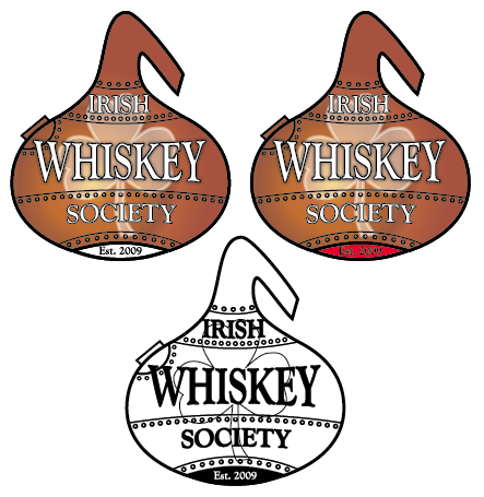
how is this?
- Attachments
-
-
-id=124.jpg)
- aaaaa(1).jpg (88.8 KiB) Viewed 3175 times
-
Happiness is having a rare steak,a bottle of whiskey, and a dog
to eat the rare steak!!!
-
varizoltan - Fully mature Cask
- Posts: 1023
- Joined: Fri Mar 20, 2009 11:03 pm
- Location: Hungary
Re: Society Logo
![]() by
Whiskey Pilgrim
» Tue Nov 24, 2009 11:57 am
by
Whiskey Pilgrim
» Tue Nov 24, 2009 11:57 am
Kaixo Guys,
Lets take a look at the Typical (or steriotypical) icons of Irishiness
1.Irish Language
2.Shamrock
3.Harp
4.Claddagh
5.whiskey
now lets take a look at the typical images for the whiskey industry
1.whiskey glasses
2.Stills
3.barrels
4.barrel ends(white painted)
5.barley straw
now lets look at Irish whiskey in terms of history and contempary style
1.tripple distill
2.double distill
3.4 distilleries
now look at the IWS club membership profile,aspirations,etc
now taking all of the above into account with a modern contempary style we should be to keep most people happy.
Agur
Whiskey Pilgrim, "Cock o´Bizkaia"!!
-

Whiskey Pilgrim - Rundlet Cask
- Posts: 102
- Joined: Mon Mar 23, 2009 8:23 pm
- Location: Gernika Bizkaia (Euskadi)Basque Region, Spain
Re: Society Logo
![]() by
varizoltan
» Tue Nov 24, 2009 1:41 pm
by
varizoltan
» Tue Nov 24, 2009 1:41 pm
why do not you put these together and see what is comes out of
it?
you may be the winner for a logo design
you may be the winner for a logo design
Whiskey Pilgrim wrote:Kaixo Guys,
Lets take a look at the Typical (or steriotypical) icons of Irishiness
1.Irish Language
2.Shamrock
3.Harp
4.Claddagh
5.whiskey
now lets take a look at the typical images for the whiskey industry
1.whiskey glasses
2.Stills
3.barrels
4.barrel ends(white painted)
5.barley straw
now lets look at Irish whiskey in terms of history and contempary style
1.tripple distill
2.double distill
3.4 distilleries
now look at the IWS club membership profile,aspirations,etc
now taking all of the above into account with a modern contempary style we should be to keep most people happy.
Agur
Happiness is having a rare steak,a bottle of whiskey, and a dog
to eat the rare steak!!!
-
varizoltan - Fully mature Cask
- Posts: 1023
- Joined: Fri Mar 20, 2009 11:03 pm
- Location: Hungary
Re: Society Logo
![]() by
varizoltan
» Tue Nov 24, 2009 1:46 pm
by
varizoltan
» Tue Nov 24, 2009 1:46 pm
at the last committee meeting, te logo was an importantone
we had more icons than the above and narrowed it down to 8-10 and it is back with the designer again
hopefully something good comes out of him thistime
but anything yous have is welcome,
show it here and we see
we had more icons than the above and narrowed it down to 8-10 and it is back with the designer again
hopefully something good comes out of him thistime
but anything yous have is welcome,
show it here and we see
Happiness is having a rare steak,a bottle of whiskey, and a dog
to eat the rare steak!!!
-
varizoltan - Fully mature Cask
- Posts: 1023
- Joined: Fri Mar 20, 2009 11:03 pm
- Location: Hungary
Re: Society Logo
![]() by
PureDrop
» Wed Feb 17, 2010 2:50 pm
by
PureDrop
» Wed Feb 17, 2010 2:50 pm
OK some more logo designs have made an appearance over the past
few months.
The following two came courtesy of a friend of JohnM
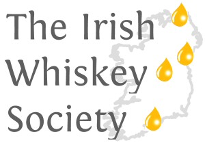
DavidH had the inspiration to use the existing distillery locations as drivers for a logo, resulting in the following:
The following two came courtesy of a friend of JohnM
-
- iws1.jpg (42.48 KiB) Viewed 3152 times
-
- iws2.jpg (32.81 KiB) Viewed 3152 times
DavidH had the inspiration to use the existing distillery locations as drivers for a logo, resulting in the following:
-
- iwsdots.png (3.95 KiB) Viewed 3152 times
-
PureDrop - Rundlet Cask
- Posts: 185
- Joined: Tue Apr 07, 2009 2:36 pm
Re: Society Logo
![]() by
PureDrop
» Wed Feb 17, 2010 2:55 pm
by
PureDrop
» Wed Feb 17, 2010 2:55 pm
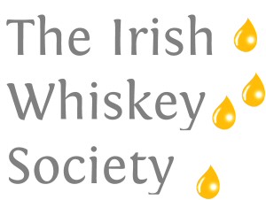
Taking DavidH's dots as a basis, I had the notion to replace the
dots with amber drops - the link to whiskey being of course
"drop of the crathur", "the pure drop",
"a wee drop", etc.
or
The "drops" can also serve as a "Motif" for aspects of the website, presentations, ...
You can even have fun with a drop.
Again, just inspiration.
/M
-
- text+drops.jpg (14.42 KiB) Viewed 3150 times
-
- dropsIRL2.jpg (16.18 KiB) Viewed 3150 times
The "drops" can also serve as a "Motif" for aspects of the website, presentations, ...
You can even have fun with a drop.
-

- drop.gif (2.47 KiB) Viewed 3150 times
Again, just inspiration.
/M
-
PureDrop - Rundlet Cask
- Posts: 185
- Joined: Tue Apr 07, 2009 2:36 pm
Re: Society Logo
![]() by
John
» Wed Feb 17, 2010 3:06 pm
by
John
» Wed Feb 17, 2010 3:06 pm
Ok, someone take the 'Magic Eye' book away from JohnM
immediately

The location/whiskey drop might serve to limit us in the future? Unless we are planning/prepared to revise the logo every couple of years?
I had actually forgotten about all this! I'm surprised though that at this stage we are still taking 'entries'; had a short-list not been drawn up a while back? Perhaps a document could be drafted with the suggested logos and members could get a perspective of what is still 'on the table' and vote accordingly?
Just a thought.
J.
Always carry a flagon of whiskey in case of snakebite and
furthermore; always carry a small snake - W.C. Fields et al.
-
John - Hogshead
- Posts: 641
- Joined: Tue Mar 24, 2009 1:32 pm
- Location: Dublin Mountains!
Re: Society Logo
![]() by
DavidH
» Wed Feb 17, 2010 3:51 pm
by
DavidH
» Wed Feb 17, 2010 3:51 pm
John wrote:The location/whiskey drop might serve to limit us in the future? Unless we are planning/prepared to revise the logo every couple of years?
Right, that's the idea. It would be a way of acknowledging the coming onstream of a new distillery, like the way the EU flag used to change every time a new member joined. It will happen very infrequently.
-
DavidH - Fully mature Cask
- Posts: 1280
- Joined: Tue Mar 17, 2009 7:49 pm
- Location: Dublin
Re: Society Logo
![]() by
varizoltan
» Fri Apr 16, 2010 12:20 am
by
varizoltan
» Fri Apr 16, 2010 12:20 am
just another idea
- Attachments
-
-
- image.png (112.89 KiB) Viewed 3114 times
-
Happiness is having a rare steak,a bottle of whiskey, and a dog
to eat the rare steak!!!
-
varizoltan - Fully mature Cask
- Posts: 1023
- Joined: Fri Mar 20, 2009 11:03 pm
- Location: Hungary
Re: Society Logo
![]() by
John
» Mon Apr 26, 2010 4:16 pm
by
John
» Mon Apr 26, 2010 4:16 pm
Hi All,
Will we have a selection of whatever logos are still in the running for review at the meeting on this Thursday?
Cheers,
John.
Will we have a selection of whatever logos are still in the running for review at the meeting on this Thursday?
Cheers,
John.
Always carry a flagon of whiskey in case of snakebite and
furthermore; always carry a small snake - W.C. Fields et al.
-
John - Hogshead
- Posts: 641
- Joined: Tue Mar 24, 2009 1:32 pm
- Location: Dublin Mountains!
Re: Society Logo
![]() by
DavidH
» Mon Apr 26, 2010 4:59 pm
by
DavidH
» Mon Apr 26, 2010 4:59 pm
At the last committee meeting we had some work ups from a
professional graphic artist, based on the ideas in this thread.
We ruled out some and sent the others back to develop some
variations. That's where it stands at the moment.
We really, really, really want to have a logo in place in May. It has been a very contentious process because everyone has an opinion and no two opinions coincide. You can see that no consensus emerged on this thread, for example. But we are nearly there, at long last.
We really, really, really want to have a logo in place in May. It has been a very contentious process because everyone has an opinion and no two opinions coincide. You can see that no consensus emerged on this thread, for example. But we are nearly there, at long last.
-
DavidH - Fully mature Cask
- Posts: 1280
- Joined: Tue Mar 17, 2009 7:49 pm
- Location: Dublin
Re: Society Logo
![]() by
IrishWhiskeyChaser
» Sat May 29, 2010 4:13 pm
by
IrishWhiskeyChaser
» Sat May 29, 2010 4:13 pm
Any one care to comment of the logo ... I have not seen what was
shown on Thursday but saw a version of it. So if someone can
post it up here that would be great.
Sláinte Adrian
- IrishWhiskeyChaser
- Site Admin
- Posts: 2910
- Joined: Tue Mar 17, 2009 1:37 pm
- Location: A Dark Dunnage somewhere in Galway
Re: Society Logo
![]() by
John
» Sat May 29, 2010 9:36 pm
by
John
» Sat May 29, 2010 9:36 pm
In fairness, it doesn't look bad and it seems to work on the
shirts and membership cards equally well. However, to be honest
though Adrian I was very surprised. I can't really see how the
logo represents Irish whiskey? One member was even heard to ask
what the crop-circles represented
Apart from that, I am very dissapointed that the Committee did not have the courtesy to put the proposed logo to the general membership for adoption beforehand. I wouldn't mind only the selected one wasn't featured at all in any fashion up to now and I can't understand what process led to its' selection. Shame really and a bit of a missed opportunity to reach a truly democratic decision within the society. It would make you wonder what else is being decided behind closed doors . We really should have the notes of committee meetings
published for transparency purposes
. We really should have the notes of committee meetings
published for transparency purposes
Apart from that, I am very dissapointed that the Committee did not have the courtesy to put the proposed logo to the general membership for adoption beforehand. I wouldn't mind only the selected one wasn't featured at all in any fashion up to now and I can't understand what process led to its' selection. Shame really and a bit of a missed opportunity to reach a truly democratic decision within the society. It would make you wonder what else is being decided behind closed doors
Always carry a flagon of whiskey in case of snakebite and
furthermore; always carry a small snake - W.C. Fields et al.
-
John - Hogshead
- Posts: 641
- Joined: Tue Mar 24, 2009 1:32 pm
- Location: Dublin Mountains!
Re: Society Logo
![]() by
IrishWhiskeyChaser
» Sun May 30, 2010 6:02 pm
by
IrishWhiskeyChaser
» Sun May 30, 2010 6:02 pm
Fair point John and I know similar points were argued within the
committee but I think it just got out of hand and became dragged
out so it ended up that it was not progressing. In the end a
professional was commissioned to create a logo from scratch and
just knock it on the head.
If it proves decisive the new committee which would be voted in next year can work on a new design.
As a fairly active member you might even consider joining the committee yourself.
If it proves decisive the new committee which would be voted in next year can work on a new design.
As a fairly active member you might even consider joining the committee yourself.
Sláinte Adrian
- IrishWhiskeyChaser
- Site Admin
- Posts: 2910
- Joined: Tue Mar 17, 2009 1:37 pm
- Location: A Dark Dunnage somewhere in Galway